|
|
| Henrihs Vorkals. A window to the world and into the world Laine Kristberga, Screen Media and Art Historian | |
| It is not easy to write about Henrihs Vorkals – there is no real prospect to come up with something new about an artist whose artistic oeuvre has been analysed in detail, not only in the local press, but also in respectable foreign publications about art. Therefore, bearing in mind that that Vorkals is a perfectionist who does not rely on blind luck, I adopted his scrupulous method of analysis and decided to deconstruct his art to its point of departure and basic unit – the grid. Of course, this structural instrument can be applied to art criticism in general, yet this time I will examine how this construction of vertical and horizontal axes organizes Vorkals’ artistic expression, beginning with textile art and ending with architecture. | |
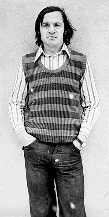 Henrihs Vorkals. Early 1970s Photo: Atis Ieviņš Courtesy of Henrihs Vorkals | |
| The grid, as no other structure, defines the art of the 20th and 21st centuries. As a subject of the fine arts, it emerged for the first time in the work of Piet Mondrian, who was made famous by the grid pictures that he painted in the 1920s. According to American art historian Rosalind Krauss in her influential essay “Grids” (1978), since Mondrian the grid has become a defining element in modern art. There are two ways in which the grid functions: one is spatial, the other is temporal. In the spatial sense, the grid is flattened, geometricized, ordered, antinatural, antimimetic, antireal – it is what art looks like when it turns its back on nature. Whereas in the temporal dimension the grid is an emblem of modernity by in itself. “By “discovering” the grid, cubism, de Stijl, Mondrian, Malevich (..) landed in the present, and everything else was declared to the past.”(1) Vorkals found the abstract painting manner of Mondrian appealing already at a very young age. As pointed out by the artist, the abstract paintings for his diploma work at the Riga College of Applied Art are reminiscent of the early period of Mondrian. The diploma work was dedicated to the centenary celebrations of Rainis, and the task was to plan and design the interior for the literature classroom of the college. In Vorkals’ design, panels with Rainis’ poems were juxtaposed with abstract paintings as splashes of colour and distributed around the perimeter of the classroom. One painting, in white and golden tones, was on the subject of the sun, another was on the theme of ‘Fire and Night’ [a play by Rainis], with black and red blocks of colour. The artist remembers: “I told everyone that I had used woven fabric motives, but what I actually thought was – Mondrian. And everyone saw both.” Although for Vorkals modern art is not an end in itself and, as he himself acknowledges, already at secondary school he arrived at the conclusion that abstract art is “passé and should be viewed as a phenomenon of the early 20th century”, geometric abstractionism is what he preferred while studying textile art, when he made carefully planned out textiles in the manner of Mark Rothko and Lucio Fontana. Vorkals began his studies at the Art Academy of Latvia Department of Textile Art in 1967 – two years after an unsuccessful first attempt to enrol in the Department of Interior Art. Nevertheless, what initially seemed misfortune was in fact good luck, which to a great extent determined Vorkals’ artistic handwriting. Studies under the supervision of the founder of Latvian textile art, Rūdolfs Heimrāts, naturally led to the principles of geometric and accurate thinking. First of all because at that time in the planning stage of any textile they had to use graph paper to draw the pattern for the fabric. And, secondly, because textile itself is a system of threads, where each thread is criss-crossed with another, in various modes and angles. Here the grid functions as an important element, both in the construction and creation of an object, and it is being manifested in geometric aesthetics. | |
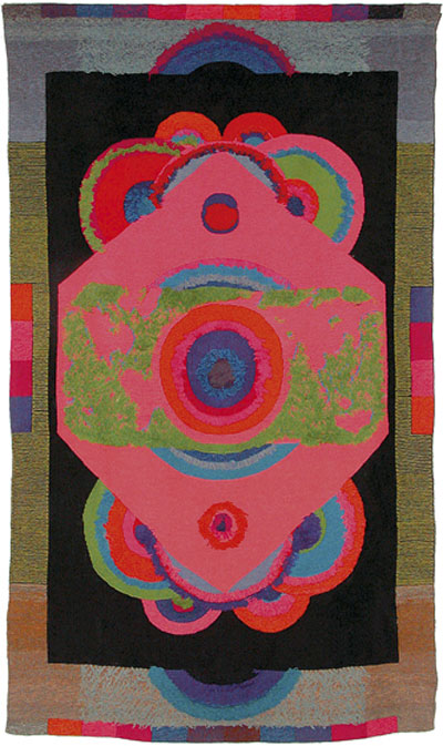 Henrihs Vorkals. Moon of the Earth. Gobelin. 300x165 cm. 1975 Courtesy of the artist and of the Museum of Decorative Art and Design | |
| Vorkals recalls that during the textile studies his manual was George Nelson’s book ‘Problems of Design’, published in 1957 in New York, and available in Russian, too. In the chapter “Structure and Fabric” the artist found confirmation of his ideas on modern art; he also followed Nelson’s philosophical concept of regarding fabric as structure, and structure being everywhere – in space, society, traffic, communications, and construction engineering. Knowing that as part of his studies he could master technologies and methods applied by Warhol and Rauschenberg, too, for example silkscreen, strengthened Vorkals’ self-confidence and conviction that he was in the right place. But textile was interesting only insofar as it could be connected with the artist’s views on modern art. Because he never had wanted to be a “true textile artist”, the discipline of textile art soon became too confined. Besides, modern art trends could be followed only on the condition: that they were not in conflict with Soviet ideology. Despite ideological and artistic restrictions, Vorkals’ textiles were far from the traditional notion of art. The geometrically structured and abstract tapestries drew the eye with their unusually bright colour palette characteristic of Pop Art. Yet, as emphasized by the artist, this was not a sign of modernity, because when visiting the archives of the National History Museum of Latvia one will be bedazzled by the abundance of colours and the vivid tones of Latvian folk costumes. The work titled Icarus (1971) is worth mentioning due to the extraordinary approach of exhibiting it, which at that time was unique in Latvia. It was a three-dimensional object and textile sculpture depicting a human figure which, according to the Latvian art critic Jānis Borgs, is a reference to the Vitruvian Man of Leonardo da Vinci. Because the work is dominated by the motif of circles, especially on the torso of the human, the object echoed with self-immolation events in 1968 in Prague and in 1969 in Riga. The human target was not the artist’s intention at all, but the textile and the exhibition at the Planetarium, where it was exhibited as the central piece, was nearly prohibited. The situation was saved only by Vorkals’ connections and good reputation. Nonetheless, textile art did not bring satisfaction, and the artist felt bored and without conviction in what he was pursuing. A significant role was played by the emergence of Andy Warhol and Robert Rauschenberg on the international art scene. In 1964 Rauschenberg was awarded the Grand Prize as a foreign artist at the Venice Biennale, whereas in 1968 Warhol received a gold medal at the Warsaw Second International Poster Biennale(2). It encouraged Vorkals to find more about these artists and their devices of artistic expression. For the first time, Vorkals understood that the language of art in Warhol’s and Rauschenberg’s works corresponded to his own feelings, and that he could associate it with himself as well. Vorkals was more fascinated by the elements that later governed in conceptual art: arrows, perforations, numbers, texts, the mixing of various techniques, the use of silkscreen, dada tricks. | |
 Henrihs Vorkals. The Portrait. Watercolour on paper. 30x70 cm. 1979 Photo from the private archive of Henrihs Vorkals Courtesy of the artist | |
| As regards the grid, in Pop Art it functions both as the armature of organisation holding together the elements of work as well as an aesthetic feature. Both Warhol and Rauschenberg used the technique of silkscreen, which previously had been used only for commercial purposes, but now allowed pop artists to reflect on the multiple reproducibility of an image and its consequent loss of meaning (like the famous phrase by Gertrude Stein: “A rose is a rose is a rose is a rose.”). The mesh, which is a component of the silkscreen mechanism in order to transfer photo images onto canvas by means of stencils, was elevated to be part of the work of art. The grid of the mesh was enlarged and offered as an aesthetic element, thus totally rejecting the idea of art where the participation of the artist could be traced. For instance, a characteristic feature of Roy Lichtenstein’s works was an accurate depiction of the dot screen. Whereas in order to group several similar images together, the grid in Pop Art was used as an organizational template. As stated by Krauss, the “reality” or its aspects that were portrayed in the work of art were ordered by means of photographic integers.(3) In Warhol’s case, the grid was more concrete than abstract. In Henrihs Vorkals’ collage-like Pop Art works, drawn in pencil, entirely all the visual elements have the same status, that is, the construction of the grid or its fragment can be seen equally with other elements. Jānis Borgs points to this visuality as apparent immaturity: “Squares are not erased or masked in any other way. Some could suspect that a clumsy dabbler, not a master, has worked here.”(4) However, because the axes of the grid stretch out in all directions to infinity, it leads the viewer think that the particular work of art is only a fragment – a tiny detail arbitrarily cut out from a larger fabric that has no definable borders. It is what, in fact, brings Vorkals closer to Mondrian, because in Mondrian’s case, too, the question arises whether that what we see in a particular painting is merely a section of an implied continuity, or the painting is structured as autonomous, organic whole.(5) To the question of whether Pop Art was at all possible in the Soviet Union, taking into account the criticism expressed at the time by Ojārs Ābols concerning the decorativeness of Pop Art after the exhibition in 1971, Vorkals answers that on this side of the Iron Curtain there was not such a vacuum of information as one might think. During Khrushchev’s Thaw, Western ideas and also artefacts (as in records and fashion, art, design and architecture magazines) reached Latvia, too. Of course, not those pages that criticized the Soviet regime. In Moscow there were also regular exhibitions of foreign art, and it was easy to get there with regular domestic flights. It is interesting that in Estonia, for example, artists of the Pop Art association SOUP 69 referred to their deliberately homespun version as “Union Pop” or “Soviet Pop”. Although the idea of including banal, everyday subject matter and the use of ready-made objects came from the Americans, the subject matter itself was always local, incorporating Soviet furniture and cheap, kitsch objects.(6) In Estonian Pop Art works the grid was also evident, for example, in the paintings of Leonhard Lapin and Andres Tolts. Although Vorkals had friendly relations with both Lapin and Tolts – and they are still friends today – the Pop Art scene between Latvia and Estonia unfortunately did not develop. Latvians zealously visited every exhibition in Tallinn and beyond, however, Estonians had not been eager to join in the common art symbiosis. Once, an Estonian art exhibition was organised in Riga, and this was followed by a party and discussions. Vorkals remembers that Lapin spoke the most, about a lot of issues and that Estonians in general were positive about the Latvian academic direction in the study process. Afterwards, the Latvians had a return exhibition in Estonia. But when they came back to Riga, Vorkals and the others were met with bad news. The Latvians studying at Tallinn Art Institute had turned to the governing body of the institute in protest, accusing Vorkals of unauthorised action. Vorkals then had to go to the KGB headquarters in order to provide explanations... As the artist confirms, “nothing bad happened”, however any further official cooperation between Latvia and Estonia was put to an end. Informally, the bonds between the nations were not severed, as Vorkals later met both Lapin and Tolts, who after graduating from the Art Institute were sent to Riga for military service. On Sundays both Estonians used to visit Vorkals and the discussions on art could continue. | |
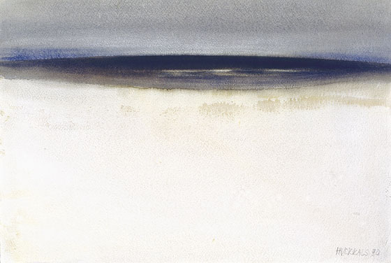 Henrihs Vorkals. The Sea. Watercolour on paper. 55x37 cm. 1990 Photo from the private archive of Henrihs Vorkals Courtesy of the artist | |
| Other than Pop Art, there is something else that is common to both Vorkals and Warhol, namely, the copying of originals. As a student at the Carnegie Institute of Technology in Pittsburgh, Warhol used to borrow photographs from the New York Public Library and trace motifs from them. At other times, he would take the outlines of drawings he liked and re-use them as the basis for new graphic works.(7) Vorkals, too, is keen on copying, but he copies the paintings of the old masters. In order to reproduce accurately, for example, Vincent van Gogh’s landscapes, the artist applies both the grid and the golden ratio formula. On occasion it has been determined that the proportions of the golden ratio have not been observed. Vorkals also points out that such copying would not be imaginable in his youth, because he would not have dared to decipher the art of such major figures. Now the reproduction of Claude Monet, van Gogh or da Vinci motifs allows the artist to identify with the great masters and enjoy painting as a therapeutic process. Vorkals also copies the works of Latvian painters - Vilhelms Purvītis, Jans Rozentāls, Jāzeps Grosvalds. From Purvītis’ oeuvre Vorkals usually reproduces the paintings that were lost during the war, whereas Rozentāls’ works are “improved, taking away the superfluous”, for instance, a church or trees in the background, focussing more attention on the characters of the human group in front. Thus, Vorkals says, he transforms the painting and creates a greater generalisation and extension of contents. Quotations of Leonardo da Vinci have appeared in Vorkals’ works more than once – indeed, in an article published in the local press a Russian journalist called the artist Leonardo da Vorkals. Da Vinci was one of the first researchers who, along with Paolo Uccello and Albrecht Dürer, in his treatises in the 15th century described the perspective as a lattice that holds together the space depicted in the painting. However, as indicated by Krauss, perspective studies are not really early instances of grids. Perspective, after all, was the science of the real and the demonstration of the way reality and its representation could be mapped onto one another. Unlike perspective, the grid does not map the space of a room or a landscape or a group of figures onto the surface of a painting. Indeed, if it maps anything, it maps the surface of the painting itself.(8) This principle is also observed by Vorkals, because in the drawn reproductions of the old masters the physical qualities of the surface are mapped onto the aesthetic dimensions of the same surface. Vorkals’ series of paintings on the subject of Gioconda is also intriguing. Da Vinci made Gioconda sit by an open window, with a landscape seen in the background. The painting could also be viewed as a metaphor about one of the central traditions of Western art, that is, to regard a painted canvas a window to the world. When looking at a landscape painted in perspective, the surface of the painting optically does not seem flat and the illusion of reality depicted in the work arises. Likewise, when we look at a landscape through a window, the frame of the window arbitrarily restricts our view, but never shakes our certainty that the landscape continues beyond the limits of what we can see at that moment. In Vorkals’ interpretation, a landscape can also be seen in the background, but Vorkals has made his Gioconda (as well as his daughter, in the role of Gioconda,) sit behind the window. The central element in Vorkals’ work is the windowsill, which formally can be considered a fragment of the grid. It reminds the viewer that they can look through this window and see the world, yet at the same time it is a two-dimensional plane – a painting that they are looking at. Thus Vorkals is playing with the viewer’s consciousness and perception, and also makes one think about the formal values of art and the illusory nature of a painting. Landscapes can also be appreciated in Vorkals’ elegant watercolour paintings done in minimalist aesthetics. Since 1981 the artist has been spending each summer in Inčupe by the sea, therefore the sea is what he mostly paints. He has been actively working with watercolour since childhood, because they were the only painting materials available at the time. Later, too, oils were not accessible because Vorkals was not a member of the Painters’ Section of the Artists’ Union (in Soviet times art materials were strictly regulated). In addition, Vorkals’ first art teacher, Georgs Veinbergs of Kandava, taught the little Henrihs painting in watercolour. At that time watercolour was popular – Veinbergs himself painted excellent watercolours in the English tradition and exhibited them at the local bookstore. His fellow student and friend was Kārlis Sūniņš, and in the summer they used to paint in the Abava valley. Later, as part of the field practice as requirement by the Riga College of Applied Art, Vorkals followed their footsteps and went on long walks along the banks of the Abava river and painted 6–8 works in a day. His contemporary Borgs remembers: “His painting with watercolour in the open air during wintertime was legendary. Water froze on the sheets of paper, creating ice-flowers that made the already very fine studies even more painterly. His chapped and reddened hands attested to his fanaticism. His watercolours were always artistically fascinating.”(9) As pointed out by the artist, in the 1970s he did not begin painting in watercolour again, rather it was that the jury commissions finally started to accept and exhibit his watercolour works. Vorkals was not satisfied with the watercolour tendencies popular at the time: “They were just mud piles diluted in water and put on paper! “Almost like in oils” had to be understood as a compliment.” According to the artist, the beauty and advantages of watercolour are manifested in the paper quality, wateriness and colour transparency. The features of watercolour as a material would make one think that the grid totally is out of place here, however, in this discipline, too, Vorkals is very precise. For any seascape the artist first draws a horizon, clouds, colour blocks, light reflection and other elements, and only then the painting follows. It is likewise important to know where to put the horizon line: “For me the sea is not a straight band at the horizon, but an ellipse on the surface of a globe.” Geometric and spatial thinking is what Vorkals exercises every day when working on architecture and design commissions. The artist does not see it as a solely pragmatic way of earning money – for Vorkals, planning an architectonic space is a process in which he “can do the stuff not possible in painting”. Usually this kind of work is carried out in tandem with a computer graphics designer, who follows Vorkals’ instructions for postproduction. When asked how it was possible to acquire such wealth of knowledge – after all, architecture is a field that requires knowledge on engineering and communications, geology, construction materials, etc. – Vorkals replied that it’s not necessary to keep all of it in one’s head. For such purposes there is a manual ‘Architects’ Data’, where all the elements have been analysed in detail. Besides, he obtained the basic knowledge in the Decorating Department of the Riga College of Applied Art, where the basics in architecture and composition were taught by architect Atis Rozentāls. Vorkals shows several three-dimensional visualisations of buildings and landscapes with an English garden and explains that each planning and design task starts with a consideration of the land plan and its parameters. Then he takes photographs of the object, mapping precisely the scale, which later gets deciphered when working on the spatial visualisation. Here, too, the grid is irreplaceable, only this time the grid is three-dimensional, thus resonating with Krauss’ definition that a three-dimensional grid (a lattice) is understood as a theoretical model of architectural space in general.(10) Vorkals’ artistic range continues to surprise with its creative potential and abundance of subjects, even in the framework of a logical and rational phenomenon such as the grid. It would not seem right to attempt to categorize Vorkals’ art, although undoubtedly it fits in with the dialectics of modern and postmodern cultures of the 20th and 21st centuries. The artist himself emphasizes that for him “these isms have never meant anything”. Although the same attitude is manifested in Pop Art, turning against styles and hostile to categories, Vorkals rather seems a conceptually thinking perfectionist with a contemporary view on art, even when tied down by the Soviet era state of affairs. Irrespectively of whether the grid construction in Vorkals’ works functions concretely – as the organizational armature of the work, or abstractly – as a contrast between continuity and a fragment, or even symbolically – as a window to the world, the grid as the measure of measures is the basic cell of Vorkals’ artistic expression. /Translator into English: Laine Kristberga/ (1) Krauss, Rosalind E. The Originality of the Avant-Garde and Other Modernisms. Cambridge, Mass.; London: The MIT Press, 1986, p. 9. (2) Also Vorkals participated in the International Poster Biennale Warsaw in 2002 with the work from the series Pop Art is dead. (3) Krauss, Rosalind E. The Originality of the Avant-Garde and Other Modernisms, p. 21. (4) Henrihs Vorkals: Catalogue of Works. Rīga: Rīgas galerija, 2009, p. 51. (5) Krauss, Rosalind E. The Originality of the Avant-Garde and Other Modernisms, p. 19. (6) Sepp, Eda. Estonian non-conformist art from the Soviet occupation in 1944 to Perestroika. In: Rosenfeld, Alla. Dodge Norton T. Art of the Baltics: the Struggle for Freedom of Artistic Expression under the Soviets, 1945–1991. New Brunswic, N. J.: Rutgers University Press, 2002, p. 75. (7) Meyer-Hermann, Eva. Cosmos. In: Andy Warhol: A Guide to 706 Items in 2 Hours 56 Minutes: Exhibition Catalogue for Other Voices, Other Rooms. London: Tate Modern, 2009, p. 16. (8) Krauss, Rosalind E. The Originality of the Avant-Garde and Other Modernisms, p. 9. (9) Henrihs Vorkals: Catalogue of Works, p. 42. Krauss, Rosalind E. The Originality of the Avant-Garde and Other Modernisms, p. 21. | |
| go back | |